Sri Hela Travels
Project Details
- Project ID
- CR-2026-BI-040
- Client
- Sri Hela Travels
- Designer
- Omalka Menuwan
- Concept Dev
- Dilakshan Chamika
- Date
- May 1, 2025
The Brand Philosophy
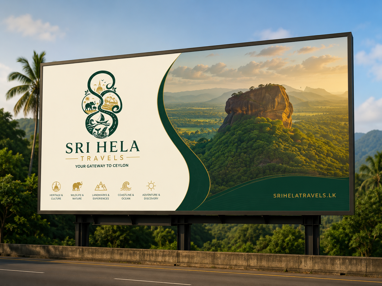
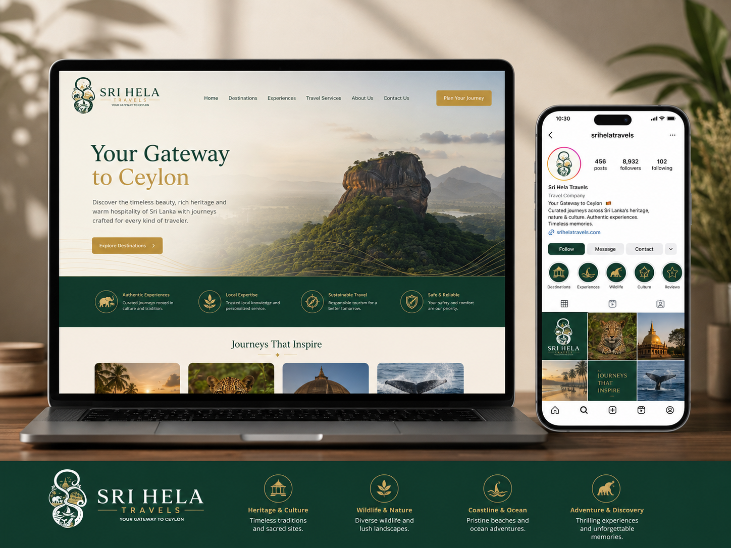
The Sri Hela Travels identity is built around a distinctive S-shaped symbol that represents a continuous journey through Sri Lanka. Within the mark, elements such as the stupa, elephants, palm trees, Sigiriya, sailing, waves, and marine life communicate the island’s heritage, wildlife, landmarks, coastline, and spirit of adventure. The refined serif wordmark, generous letter spacing, and balanced proportions give the brand an elegant and professional character, while the tagline “Your Gateway to Ceylon” clearly positions Sri Hela Travels as a trusted guide to authentic Sri Lankan experiences.
The colour system strengthens this positioning: forest green communicates nature, trust, and cultural roots; heritage gold suggests warmth, excellence, and legacy; and warm ivory creates clarity, comfort, and a premium visual atmosphere. Together, the symbol, typography, and colours create a recognisable and flexible identity that can remain consistent across websites, social media, travel documents, signage, merchandise, and digital icons. This consistency helps build brand recognition, increases customer confidence, differentiates Sri Hela Travels from competitors, and supports a memorable premium travel brand.
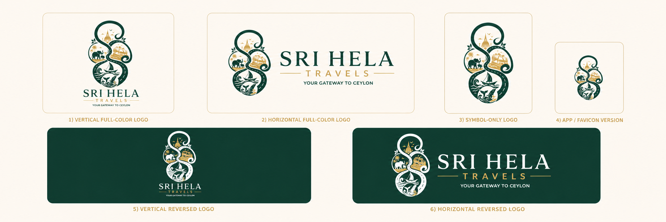
Logo Variations
Applications